PISA Data Analytics, Correspondence Analysis
The PISA database contains, in addition to the scores of students, a lot of demographic, socioeconomic and cultural data about them, collected through a series of questionnaires, that allow contextualize the academic results and make studies with a great number of variables. Most of these data are categorical, making the correspondence analysis a particularly appropriate tool to work with them. In this article I will show you how to easily perform this analysis using the ca package of the R program.
The PISA data can be obtained from the PISA official website of the OECD. In this blog I posted a SQL Server version of the PISA database, which you can download and install locally. In the link above you can also access a tool to query the database and obtain samples.
In this article you can see an introduction to PISA data analytics, and on this link you can download the R code examples of functions that I will use to data sampling in this article. In this other link you can download R source code to create a contingency table with PISA data.
In this other link you can download a file with sample data that I will use in this article. It contains data from three countries, Finland, one that gets better results, Spain, located in a middle level, and Peru, one of the last of the classification, for the year 2012.
The correspondence analysis
Make a deep study on the fundamentals of correspondence analysis is beyond the scope of a post on a blog, so I recommend the book Correspondence Analysis in Practice, by Michael Greenacre, where you can find an excellent and simple exposition of everything about this analysis technique.
Basically, the correspondence analysis is a technique for optimal scaling of data, which allows graphical representation in the form of maps, usually two-dimensional, where you can see the relationships between the rows and columns of a contingency table.
Consider the rows and columns of the table as a series of n-dimensional vectors, being n the number of columns in a row, or rows in a column. In this way you can see a row or column as a point in an n-dimensional space, whose coordinates are the corresponding proportions of the crossed values of the factor, with a continuous value between 0 and 1. We call these vectors row or column profiles.
The marginal frequencies of the rows and columns form a new profile called average profile. There is an average column profile and an average row profile. The correspondence analysis can be undertaken with the rows or columns as a reference, obtaining equivalent results. It is a symmetric analysis tool.
If you take, for example, the rows as the reference, you can consider a region of a space of dimension m - 1, where m is the number of coordinates or columns of each row, delimited by the points where each of the rows represent the 100% of elements of the columns. This region is called simplex, and in a three dimensional space, for example, would be the plane through the points (1,0,0), (0,1,0) and (0,0,1).
Within this space, you can plot the points corresponding to each of the columns, using the proportions as coordinates corresponding to each of the rows. These points are all on the surface of the simplex.
It is evident that these points will be found closer to the vertices corresponding to the coordinates with higher relative frequencies of each column. In correspondence analysis, the relative weight of each of the coordinates of the profiles of each row or column is called mass. Each row or column also has a total row or column mass, corresponding to its marginal frequency.
The row and column with the marginal frequencies, or row profile and column profile can be considered as the average profile for all rows or columns, and are called centroids. From here, you can calculate a distance from each of the rows or columns to its centroid or row or column average, so that, if you expect all of them are similar to the average, you can quantify how much they deviate from this hypothesis and their statistical significance.
As distance measure, the chi-squared distance is used, calculated from the ratio of the difference between the observed and expected values squared and the expected value, where the observed value are the actual coordinates of the row or column and value expected is the average profile of rows or columns.
This statistic follows a χ2 distribution with (r-1)(c-1) degrees of freedom, where r is the number of rows and c the number of columns, so we can accept or reject the hypothesis of homogeneity between rows or columns easily.
The chi-squared distance gives us an idea of the degree of dispersion of the points on the graph map of the correspondence analysis. A measure derived from this statistic, called inertia, is calculated from the distance chi-squared and the total number of elements in the row, column or entire table, which gives us a measure of the variance independent of size.
As is normal that we use this technique to analyze relatively large data tables, where is not easy to see the relationships between the data, we will have high-dimensional profile spaces, while the graphic representation is performed in a two-dimensional space, three at most, so it will be necessary to project the points. To perform this operation, we use a technique called singular value decomposition, or SVD. Optimal scaling techniques are also used to locate the projected points so that the relations between them are shown as clearly as possible.
This way, we are working with categorical data as if it were continuous values.
Correspondence analysis with R
Now I will show how to perform in practice this type of analysis with the R program and one of the packages dedicated to correspondence analysis, the ca package.
First, we load the sample data in csv format, in a dataframe, and the scripts with the data sampling functions:
data<-read.csv("ca-filters.csv",sep=";")
source("pisa-sampling-code.r")
source("sample-ppc.r")
Recall that in the PISA database, the data from a student does not represent an individual but a group of individuals, so we must use the weights assigned to each record to weight calculations.
The data columns are the following:
names(data)
[1] "YEAR"          "STUDENTID"     "SCHOOLID"      "COUNTRY_NAME"
[5] "SUBNATIO_NAME" "STRATUM_NAME"  "ST115Q01_2012" "ST26Q06_2012"
[9] "ST26Q07_2012"  "ST08Q09_2012"  "W_FSTUWT"
Of these, we are only interested in COUNTRY_NAME, which is the name of the country, and the last five, which contain data on the student and the weight.
There are data from three different countries, Finland, Spain and Peru, with different number of records:
summary(data[,"COUNTRY_NAME"])
Finland    Peru   Spain
   8829    6035   25313
First, we obtain a sample with an approximately equal number of records for all countries without missing values, with the data of country, weight and the ST08Q09_2012 column, which contains data on full days that the student has missed class:
summary(data[,"ST08Q09_2012"])
  1-2   3-4    5-     N  NA's
 6356   782   372 32239   428
The data are divided into four categories, 1 or 2 days, 3 or 4 days, 5 or more days and N to indicate that the student has not missed any day. To get a sample without missing values we will use the following function:
datas<-wght_multiple_sample(data,"COUNTRY_NAME",
    c("ST08Q09_2012","W_FSTUWT"),50000,"W_FSTUWT")
Where the parameters are the column with the country, the additional columns you want to get, the maximum number of samples per country and the column containing the weights. We rename the columns for readability of the graph. This is the result:
names(datas)<-c("COUNTRY","D","WEIGHT")
summary(datas)
      PAIS         D              PESO
 Finland: 8645   1-2: 6356   Min.   :  1.008
 Peru   : 5997   3-4:  782   1st Qu.:  3.325
 Spain  :25107   5- :  372   Median :  8.076
                 N  :32239   Mean   : 21.463
                             3rd Qu.: 33.012
                             Max.   :297.305
Now let's get a contingency table crossing the three countries with the number of days, weighted, that the students have missed a class:
mtx<-wght_ppc_bycnt(datas,"COUNTRY","D","WEIGHT")
mtx
              D-1-2        D-3-4         D-5-        D-N
Finland 0.006319715 0.0005741573 0.0004663525 0.06328732
Peru    0.055626536 0.0107576788 0.0035847888 0.42217349
Spain   0.105852223 0.0115135558 0.0051497598 0.31469442
With this table, it is very easy to perform the correspondence analysis:
require(ca)
ca1<-ca(mtx)
plot(ca1,map="colprincipal",mass=c(T,T))

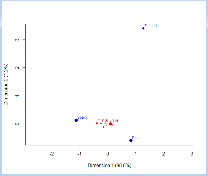
With the map parameter we have indicated that we want that the main coordinates be the columns, which are shown in reference to the vertices, where are the countries. The mass parameter is used to indicate that we want to draw the symbols that represent the various points with a size proportional to their mass.
In the graph we can see that not miss any full class day is the most common, in similar proportions in all three countries, though a bit more in Finland and Peru. Miss a few days, between 1 and 4, it is more common in Spain than in the other two countries, though missing 3 or 4 days has a similar frequency between Spain and Peru. We also see that missing 5 days or more is practically anecdotal, by the small size of the symbol, and the frequency is more or less similar in all three countries, as it is quite close to the center, although somewhat higher in Spain. We can confirm this by checking the contingency table.
If we examine the ca1 object containing the data of the correspondence analysis, we can see the following:
Principal inertias (eigenvalues):
           1        2
Value      0.033218 0.000423
Percentage 98.74%   1.26%


 Rows:
         Finland      Peru     Spain
Mass    0.070648  0.492142  0.437210
ChiDist 0.241314  0.149918  0.205517
Inertia 0.004114  0.011061  0.018467
Dim. 1  1.267201  0.819762 -1.127524
Dim. 2  3.398378 -0.599934  0.126178


 Columns:
            D-1-2     D-3-4      D-5-      D-N
Mass     0.167798  0.022845  0.009201 0.800155
ChiDist  0.391888  0.201091  0.247627 0.089320
Inertia  0.025770  0.000924  0.000564 0.006384
Dim. 1  -2.149648 -0.825093 -1.357733 0.489967
Dim. 2   0.423008 -6.487395  0.443576 0.091414
First we have the total inertia explained by each of the two dimensions. You can see that you can distribute the 100% of the inertia between the two dimensions.
Below are the values of the analysis of the rows (countries). In this case, the mass is proportional to the population of each country. The ChiDist row contains the chi-squared distance to the centroid or average profile of each country. We have another row with the inertia of each of the countries and, finally, the coordinates of each in the dimensions 1 and 2.
The same applies to the corresponding columns with the count of the days that students missed classes.
We can view another example with two other variables from the sample data. The ST26Q06_2012 column, which indicates whether the student has an internet connection, encoded as N (not) or Y (yes), and ST26Q07_2012, indicating whether there are books of classical literature at home, encoded in the same way. First, we perform a sampling without missing values:
datas<-wght_multiple_sample(data,4,c(8,9,11),50000,11)
This time we have made the sampling indicating the index of columns instead of their names. Now we build a new column from the INTERNET and LITERATURE ones with the four possible combinations:
c<-paste(datas[,2],datas[,3],sep="-")
datas<-cbind(datas,as.factor(c))
names(datas)<-c("COUNTRY","INTERNET","LITERATURE","WEIGHT","I+L")
We build the contingency table with this last column:
mtx<-wght_ppc_bycnt(datas,1,5,4)
mtx
            I+L-N-N      I+L-N-Y    I+L-Y-N   I+L-Y-Y
Finland 0.000225593 4.605372e-05 0.03448387 0.0364791
Peru    0.079078933 2.073570e-01 0.05093388 0.1551462
Spain   0.011895258 1.123424e-02 0.13828133 0.2748386
And we perform the correspondence analysis again:
ca1<-ca(mtx)
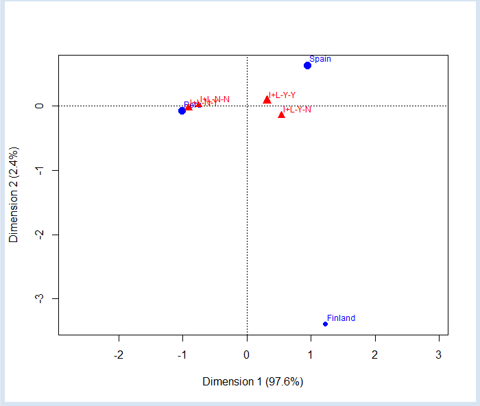
plot(ca1,map="colprincipal",mass=c(T,T))

We can see that in Peru is much more common to not have internet than in Spain and Finland. We can also check that in Finland is more normal to have internet than literature at home. In Peru is more normal to not having internet, but possess literature at home. However, keep in mind that having both have a fairly large mass and is quite close to the center, indicating that it is quite common in all countries not be confuse by the position of the N-N case (nor Internet nor literature) so close to Peru, it's just in this country where are most cases, but is not the norm, as its incidence (mass) is very small.
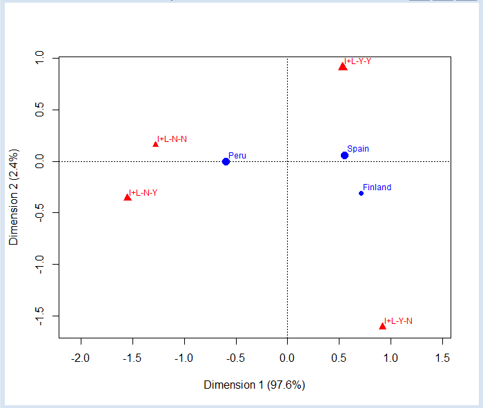
The correspondence analysis is symmetrical, which means that always is performed for both rows and columns. We can plot the graph using the row coordinates as the main ones simply changing the parameter map:
plot(ca1,map="rowprincipal",mass=c(T,T))

Now the reference categories are the columns, which occupy the vertices of a tetrahedron of three dimensions that we have projected onto two dimensions. We can see that in Spain and Finland have no internet is almost anecdotal, since they are located almost on the line joining the vertices Y-Y and Y-N.
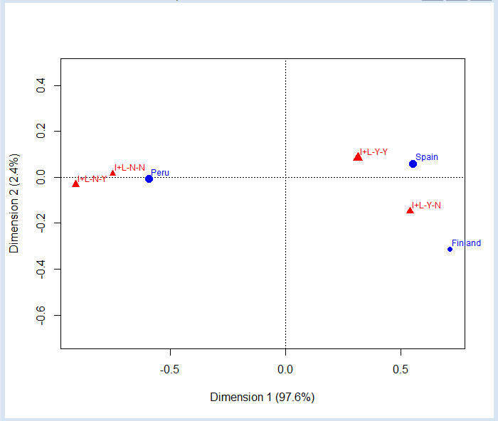
We can also draw the map using the same scale for rows and columns:
plot(ca1,map="symmetric",mass=c(T,T))

These examples have a low dimension, so they are quite trivial. In practice, this type of analysis is used to study the relationships of contingency tables with large numbers of rows and columns, where there are no longer so obvious the relationships between the elements.


