Complex Time Series IV, power spectrum and distribution
In this new article of the series dedicated to the graphic characterization of complex time series I will talk about two other graphical tools that can be useful, the power spectrum of the signal, which will be obtained through the Fourier transform, and the graph of the distribution of values of the series, a simple histogram with the frequency of the different values that also can provide us information about the series dynamics.
As usual, if you want to start the series at the beginning, this is the link to the first article of the series on graphic characterization of complex time series. In this other link you can download the executable and source code of the GraphStudy project, written in CSharp with Visual Studio 2013.
Working with data files with GraphStudy
So far, we have generated the time series by means of differential equations or iterated functions. Normally, what you will have at your disposal are raw data obtained through measurements of real phenomena, and the functions from which comes the data are always unknown, if they exist.
With GraphStudy you can also work with data either from csv files or data files generated by the program itself. To record the data generated by the time series obtained by equations, simply use the Save Data option in the File menu to save the data series in a binary file with extension tsd. They can also be saved as csv files using the Export Data to CSV option, also in the File menu. In this case, the program generates a file for each one of the dimensions of the series, with the name of the corresponding variable appended to the end of their file name. With this, we can exchange data with other programs, such as the R program.
If, instead of opening a file with equations, with the expr extension, we open a csv or tsd file, the following window with the various commands that can be applied to the data will appear, many of them similar to those we have seen in the panel of equations:

With the buttons X, Y and Z you can select the dimension on which the program performs some commands. For example, having selected the X dimension, if you press the button DFT, you get the discrete Fourier transform corresponding to the time series of this dimension.
The discrete Fourier transform
The Fourier transform consist basically in operate with the data, which are in the time domain in the form of time series, and transform them so that they turn into the frequency domain, i.e. we transform them into a spectrum with different harmonics that are present in the series.
For example, a sinusoidal function consists of only one frequency, so, with the transform, only one significant value for that frequency is obtained, as a complex number representing the amplitude and phase of that signal frequency. To represent the graph of the power spectrum of the signal, the module of these complex values is used, drawing a vertical bar, for example, for each.
The calculation of the Fourier transform is quite demanding in resources. With long time series, the computer can eternalize calculating, so, instead, a "light" version of the algorithm called fast Fourier transform, or FFT for its acronym in English, is used. We lose resolution compared with the complete calculation, but, as its name suggests, is very fast, and gives us an idea approximate enough.
In GraphStudy we can get the DFT of a series with the DFT button, both in equations and data panel. If you press the right or left mouse button over the graph you can go expanding it by delimiting the start and end points of the displayed data.
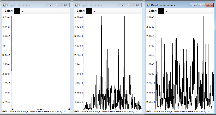
In this image you can see three examples of DFT graphs for three different types of time series:

The first from the left belongs to a logistic periodic series, there is only one dominant frequency, as you can see at the left end of the graph (the graph obtained is symmetrical with respect to the center of the graph).
The central graph belongs to the logistic equation with a chaotic dynamics, you can see that the frequency spectrum becomes almost continuous, with lots of harmonics.
The last graph corresponds to a totally random series generated with the rnorm function with the R program, here is still more accentuated the continuity of the power spectrum.
The graph of the power spectrum of the signal can be helpful when determining whether a series has a complex dynamics, but is not generally regarded as a decisive tool. There is a useful data that you can get from this frequency spectrum, which indicates you if the series contains sufficient information regarding their periodicity, i.e., if it includes the maximum data period within which the dynamics is repeated. To do this, the Nyquist frequency can be considered, which is the frequency obtained from the inverse of twice the sampling time interval:
Fc = 1/2Δt
If all frequencies below this frequency are observed in the graph, we can say that the series contains the information necessary for their proper study. Otherwise, or we have an insufficient amount of sampled values, or the sampling interval is too long, so the series will be distorted. This can be seen in the graph corresponding to the random series, since the DFT doesn't tend to zero at its ends, but remains forming a continuous band. In the spectrum of the periodic series is observed, as opposite, the only dominant frequency.
Distribution of the series values
Another graphical tool that can provide visual information about the behavior of the series is simply to draw a frequency histogram of the different values that compose it. In GraphStudy you can display the histogram using the P. Extend button, after selecting the dimension you want to appear reflected in this graph.
In the window that appears, with the representation of the series, you have to press the Start button for the program to build and draw their histogram. Because we assume that the values of the series are continuous, there is a text box to specify the resolution with which we want to draw the histogram. The program will divide the values of the series between as many columns as we indicate in the Resolution box.
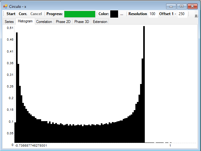
The histogram for periodic series will look like this:

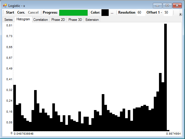
The histogram corresponding to the series with chaotic dynamics are irregular, without a recognizable definite form:

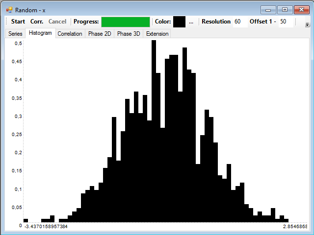
Finally, if the series is composed of random values, it will present the form of the probability distribution from which they come, for example, this is the histogram of the series of random values with a normal distribution:

In teh next article I will talk about autocorrelation and extension of the dimension of the series.


