Implementing correspondence analysis with C#
The correspondence analysis is a statistical technique that allows us to study relationships between categorical data through optimal scaling and orthogonal projection in two or three dimensions of contingency tables. Its implementation is relatively simple, and in this article I will show an example using the CSharp language. In addition, the sample program allows you to draw simple graphics with the resulting data.
In this article I showed the correspondence analysis with PISA database, using the R program. Same as there, I recommend the book Correspondence Analysis in Practice, by Michael Greenacre, if you are interested in a text explaining simply and comprehensive this data analysis technique.
The correspondence analysis
Since I cannot give you a thorough exposition of the technique of correspondence analysis in a simple article of a blog, I will try to write a little summary on it, and I refer you to the specialized literature for a deeper study.
We start from a contingency table crossing two sets of categorical data. In this article I will use as an example a table with data of self-perception of health, crossing a Likert scale (from very good to very bad), with a range of age groups (from 16 to 24, to more than 75).
The first thing we do with this table is to calculate the marginal frequencies of rows and columns, which are nothing more than the sum of the data in each row and each column. In correspondence analysis these marginal frequencies are called mass of the row or column. We consider the row with the masses of the columns and the column with the masses of the rows as an n-dimensional vector called the average profile of the rows or columns.
If we divide the values in each row or column by its mass, what we get is a series of n-dimensional vectors with the relative frequencies for each row or column, called row and column profiles. It represents the proportions of the data considering the row or column as a separate entity composed of 100% of individuals for the corresponding category.
With this row profile or column profile and the average profiles we can calculate a distance that indicates how similar the profile of the row or column and the average profile are. We use the chi-square distance, which is the square root of the sum of the squared differences between the components of the row / column profile and the average profile divided by the average profile.
Using this distance we can calculate a derived measure called inertia, which is simply the square of the chi-distance multiplied by the mass. The inertia gives us an idea of the degree of dispersion of the data, it can be seen as a weighted average of the distances, and can be considered as an indicator of the variance of the data. If we sum the inertia of all rows or all columns, we get the total inertia of the table. The higher the value is, the more separated are the rows and columns from their average profile or centroid.
Finally, we are interested in the graphical representation of the data to visualize possible relationships between them. Since we are considering the rows and columns as n-dimensional vectors, we need to reduce their dimension in order to represent them, usually in two dimensions. For this, we use the technique of singular value decomposition or SVD, which is a generalization of calculating eigenvalues of square matrices to rectangular ones, and provides a set of values and vectors with which we can project a matrix MxN in another of 2xN or Mx2, preserving as much as possible of the information contained on the data. It is decomposed in three other matrices:
S = UDVT
Where D is a diagonal matrix whose diagonal consists of the singular values in descending order and U and V are matrices with the left and right singular vectors. S is calculated from the contingency table P as follows:
S = Dr-1/2(P - rcT)Dc-1/2
Where Dr-1/2 is a diagonal matrix whose elements are the inverse of the square root of the average profile of the rows, Dc-1/2 is the same for columns, r is the average profile of rows and c that of columns. P is the contingency table.
In the graphical representation, to represent the rows we reduce the M columns to 2 using this projection, which will be the coordinates in two dimensions of each row. For columns we do the same with the rows. The rows and columns are represented together, using two different types of coordinates.
On one side are the standard coordinates, which are calculated by dividing the first two vectors of the U matrix of the SVD by the square root of the mass of the rows, to get the coordinates on dimension 1 and 2 of the rows, or the first two vectors of the matrix V by the square root of the mass of the columns to get the column coordinates. These coordinates represent the vertices of the categories, i.e., the points on which all elements belong to that category.
On the other side are the principal coordinates, which are obtained by multiplying the standard coordinates by the first two singular values. These coordinates represent the position of a particular row or column in relation to the average profile.
With these coordinates, we can represent the two-dimensional graph showing the rows using principal coordinates and the columns with standard coordinates, the inverse to show the columns using principal coordinates, or showing both using principals in a graph that is called symmetric.
The CADemo program
To show how to implement this analysis technique, I developed a sample project. In this link you can download the source code of the CADemo project, written in csharp with Visual Studio 2013.
As an example of data, in this link you can download a csv file with health auto-perception data. The rows correspond to age groups by 10 to 10 years, starting with the group between 16 and 24, the next between 25 and 34, and so on. The columns are numbered from 1 to 5 and represent the self-perception of health status, with 5 being very good, 1 very bad and 3 regular. The data cells contain the percentage of cross responses between these two factors. The program will always work with tables in this format, with row and column names, and data expressed in proportions between 0 and 1.
This is the look of the program:
As we work with csv files, we can indicate the character used to separate columns and the decimal part of numbers. We can also indicate the accuracy we want to use when rounding calculations.
With the icon in the left of the toolbar, you can select and load a csv file with data. This is the example data file health.csv:
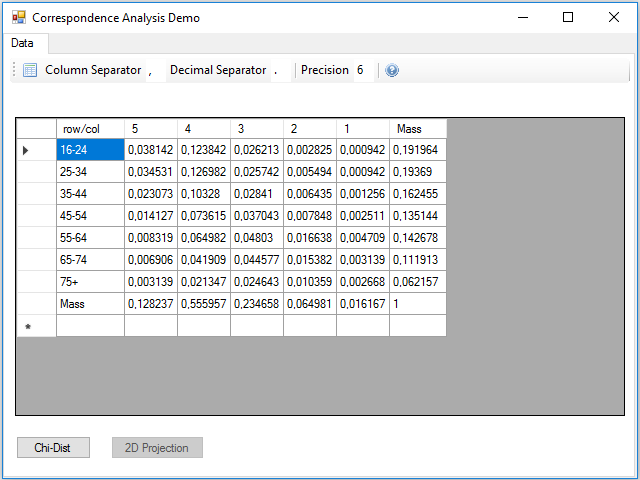
Although the calculations can be performed all at once, one after another, I preferred to divide the data processing into three parts, to make it easier to read and understand the code. The first part is the reading the table from the csv file, at this stage the masses of the rows and columns are calculated, remember that they are simply the marginal frequencies. This process is contained in the Click event handler of the button.
The next step is to calculate the chi-square distance and the inertia, for this we have to press the Chi-Dist button. In the Click event handler of this button these calculations are made, and two new rows and columns are added to the data table with the result for rows and columns:
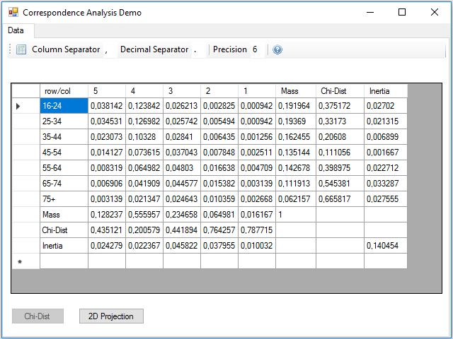
At the intersection between the inertia row and column, there is the total inertia of the table, which is not more than the sum of the inertia of the rows or columns.
The next step is to calculate the two-dimensional projection. Notice that we have 7 rows and 5 columns, i.e. vectors with 7 or 5 coordinates, depending on viewing by rows or columns. We need to represent the vectors reduced to two coordinates. As I said before, the procedure is to use the singular value decomposition, but this calculation is quite complicated, so I will use a mathematical library that can be installed from a package in the NuGet repository, it is the Accord.Math library that you can find searching by the keyword svd.
Pressing the 2D Projection button, the calculations to obtain the standard and principal coordinates of the rows and columns are performed; these coordinates are added in 4 new rows and columns, two for the two dimensions of the standard and two for the principal ones:
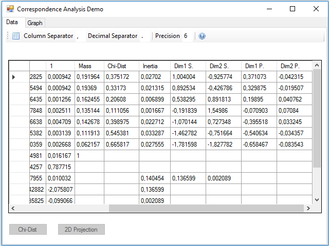
We could have projected in three dimensions instead of two to make a three-dimensional map, just using one more of the vectors and singular values obtained in the SVD. In the inertia row and column they were added two new values that correspond to the projected inertia in each of the dimensions. You can see that the sum is less than the total, this difference gives us an idea of the lost inertia by reducing the size of the data.
Finally, we can see that there has appeared a new tab, Graph, where we can see a sample of the graph of the correspondence analysis, implemented in the Paint event of the panel that contains this tab:
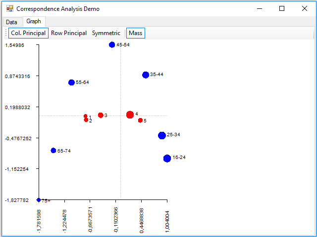
Where dimension 1 is on the horizontal axis and the 2 on the vertical. With the buttons of the toolbar, you can display data using principal coordinates for the columns, for the rows, or for both (with the Symmetric button). You can also show the points with a size proportional to the mass using the Mass button. The rows are painted in blue and the columns in red.
About the details of the implementation, the code is simple to read and understand, but if you want a detailed explanation, in this link you have the code commented in the Code Project site.


